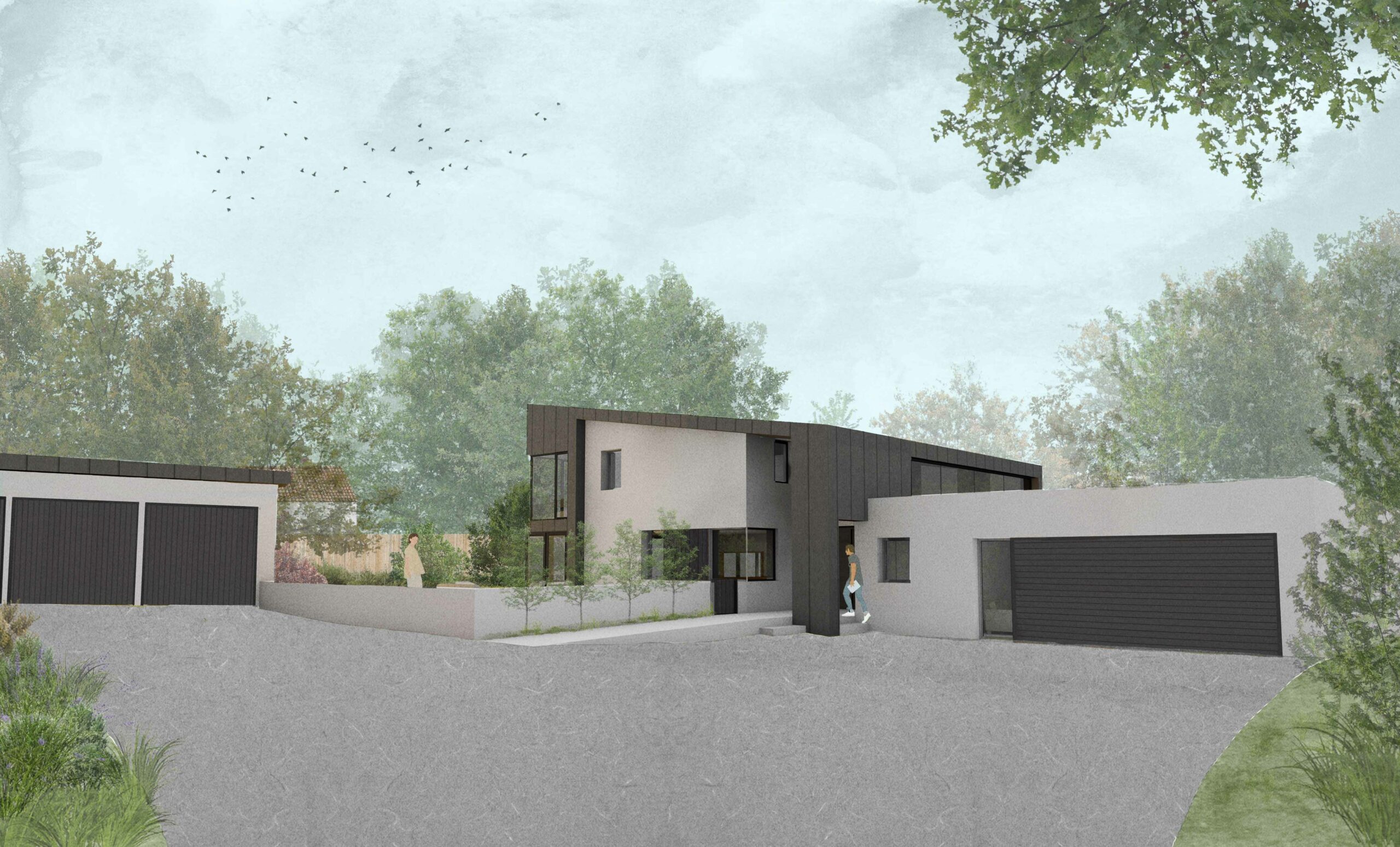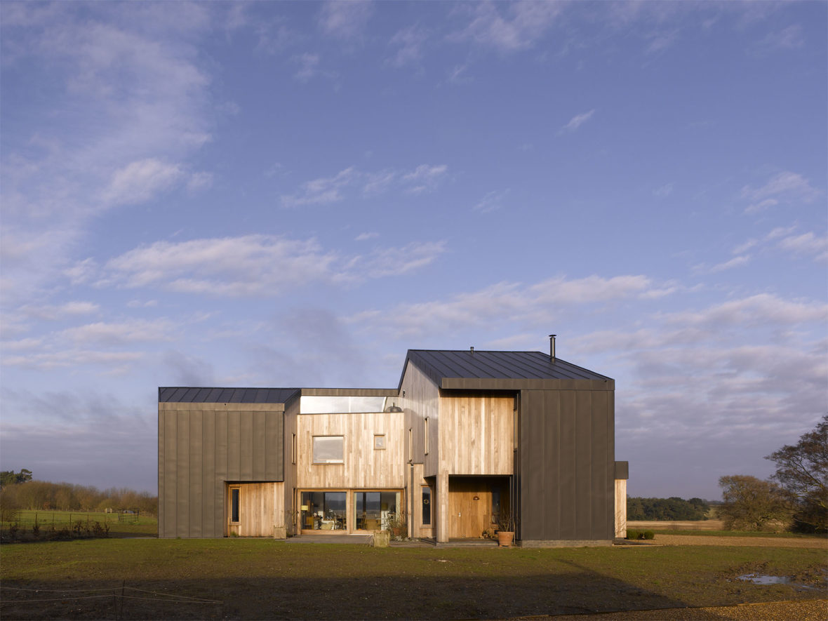
Bavent House, a new family home that responds to its spectacular saltmarsh location on the Suffolk coast.
Exposed to the full blast of North Sea Winds, Bavent House turns an awkwardly oriented site into a positive attribute. By making the most of magnificent views across the reed marshes, open countryside with glimpses of the sea. The internal layout and character of the rooms respond to this and at the same time give the owners, a home that enriches family life and effortlessly accommodates frequent guests and extended family.
Making the Most of the Views
Sites in open countryside that have a difficult orientation inevitably place greater demands on the design and arrangement of spaces than those with more ideal aspects; but of all orientations the most awkward is having amazing views to the north contrasted with dreary ones and arrival to the south. Bavent House has all three.
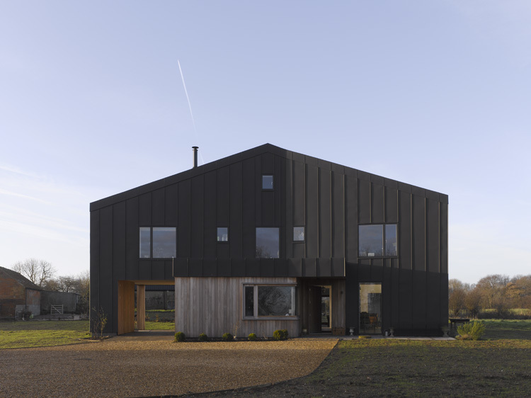
Each face of the new family home has its own narrative. The north elevation, inspired by fisherman’s huts on Southwold’s shingle beach nearby, exhibits a slight kink and change of direction where the orientation of the house itself twists to make the most of the views. While the south elevation is ‘cracked open’ like an egg, opening it up to the sun and revealing views.
Protection from the weather
The black zinc cladding protects the house from buffeting weather and refers to the black-tarred finish of fishing huts. Carved out of this skin are timber-clad pockets of space that catch the sun and provide views alongside shelter from the weather.
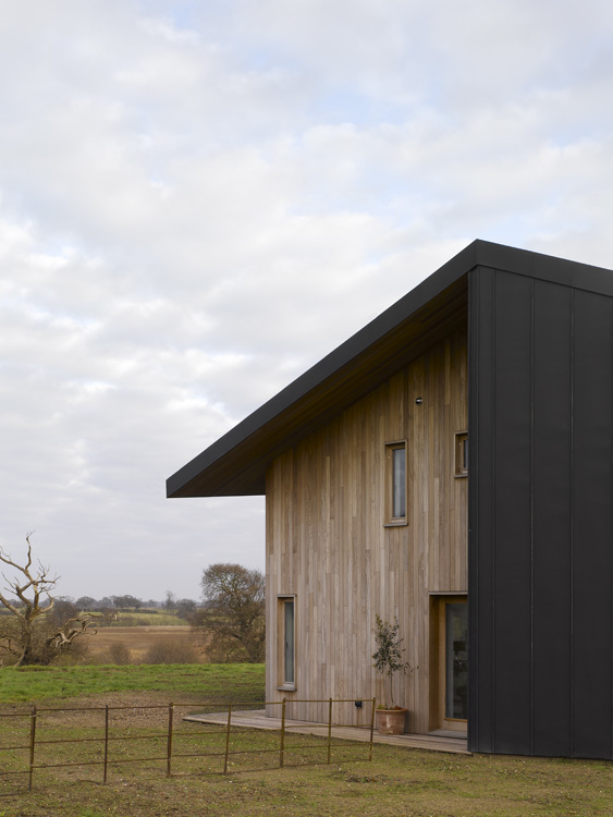
On the west elevation the zinc roof over-sails provide protection from winds and a sheltered spot to sit on sunny evenings. The other spaces around the edge similarly provide havens depending on wind, time of day or season. These potentially inhabited spaces have a softer treatment with the use of iroko timber panelling that has faded, mimicking the colour of surrounding reed beds.
Use of light
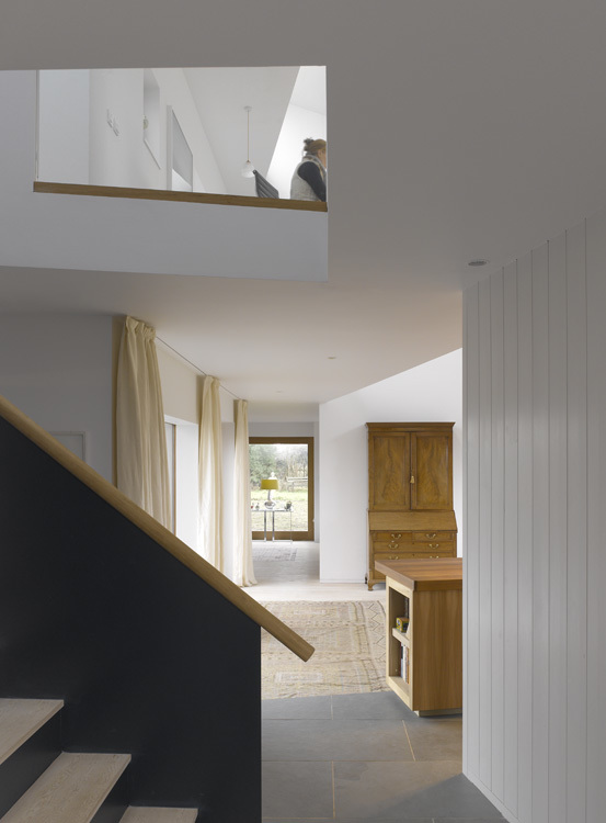
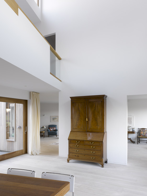
The arrangement of the windows demonstrates how light is captured and brought into the house. A clerestory above the double-height dining space brings in morning to afternoon sunlight, while the first-floor windows on the mezzanine watch for arriving visitors.
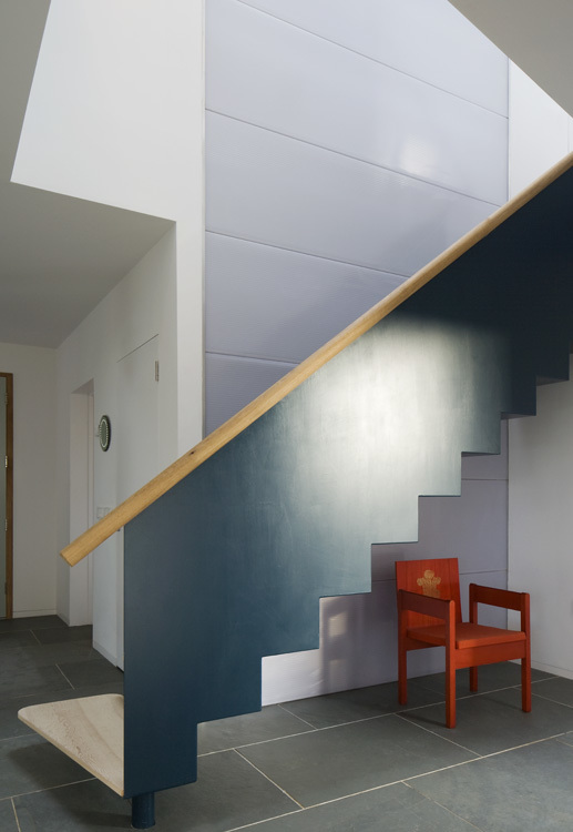
The main staircase off the hall was fabricated off-site from steel and appears as a bridge to the first floor, set against a translucent polycarbonate wall that brings natural light into the guest cloakroom and first floor bathroom. With the first-floor landing lit by a rooflight that traces the sun’s path mimicking a sundial.
A Network of Open and Connecting Areas
Each individually distinct room, communicates with its neighbour, giving the house a network of open and connecting areas in which the family can exist alongside or separately from one another. The focal point at the centre is a double-height dining room, emphasised by the first-floor balcony and study space overlooking it. This is sandwiched on either side by two wings of the house that wrap around the courtyard.
This compact arrangement allows the family to remain in touch with each other as they go about their daily lives. However, there are also places for privacy, such as the snug that projects out of the house or the alcove in the main living room.
Responding to a wonderful but difficult site, Bavent House, like no other houses before it, continues to explore the relationship between the exegesis of needing an understandable, readable exterior with an interior that is rich with spaces and rooms of varying volumes, character and relationships.
This blog was redacted from “An Open Mind: The work of Hudson Architects” with words written by Anthony Hudson and published by Artifice. The book can be purchased by clicking here.
Photography by James Brittain.
